
Creative Direction
via “The Elite News”
The Elite News was an internal culture-focused publication that I managed and lead in its entirety for 11 editions, until it’s eventual end with issue 38. Under my direction, the Elite News underwent a re-brand and gained more viewership with each subsequent edition.
I also oversaw and directed photoshoots, led and directed design, determined featured articles, maintained tone with copywriters, and kept each edition on track with process. We were able to implement data into our digital versions and have had senior leaders pass out physical editions to both internal and external folks to this day. All in all, the Elite News was a huge success and was a prime example of creative direction growth over the course of three years.
Below, I have selected two different editions put together by amazing teams with a drive towards a consistent vision that elevated the culture and showcased a successful collaboration of photography, design, and teamwork.
Issue 38
〰️
Issue 38 〰️

Design Direction
While we did not know at the time, the 38th edition of the Elite News would be the final, but it turned out to be one of our best. The vision was a “Yearbook Edition”, as we wanted to make something that encapsulated a great year and had a look that the Elite News had never attempted.
The idea was to go for a nostalgic vibe with portraiture reminiscent of school yearbook photos. This style would now be referred to as a subtle “retro futurist” style with emphasis on small doodles, bright colors, and optimism. The mood board and directive guided designers to make spreads and other design assets to match this theme.
Directive for Design Style
Mood Boarding for issue
Design by Manda Villarreal
Design by Martin Querio
Design collaboration by Mollie Ropp and Martin Querio
Design by Martin Querio with Photoshoot by Carrie Pitzer

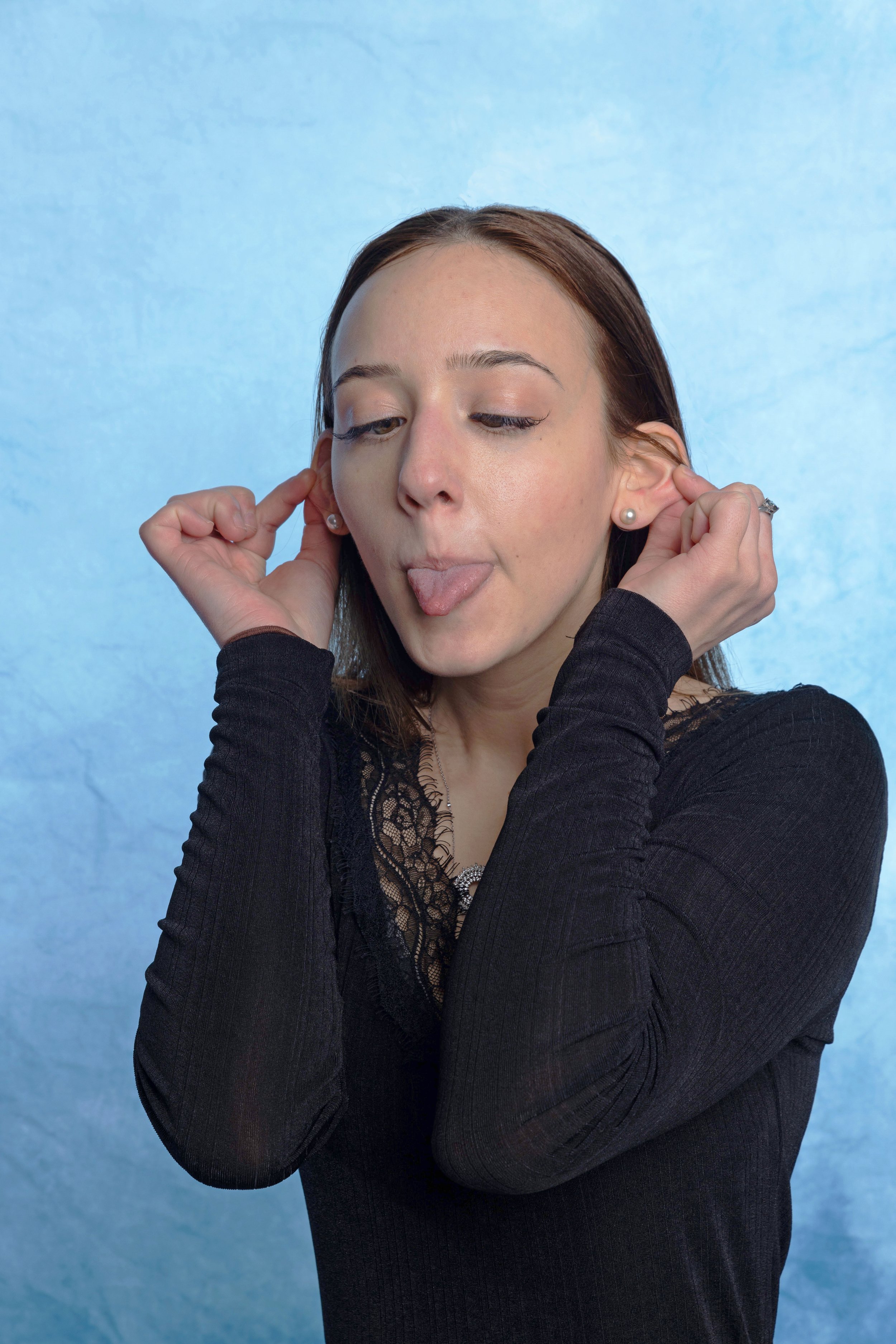
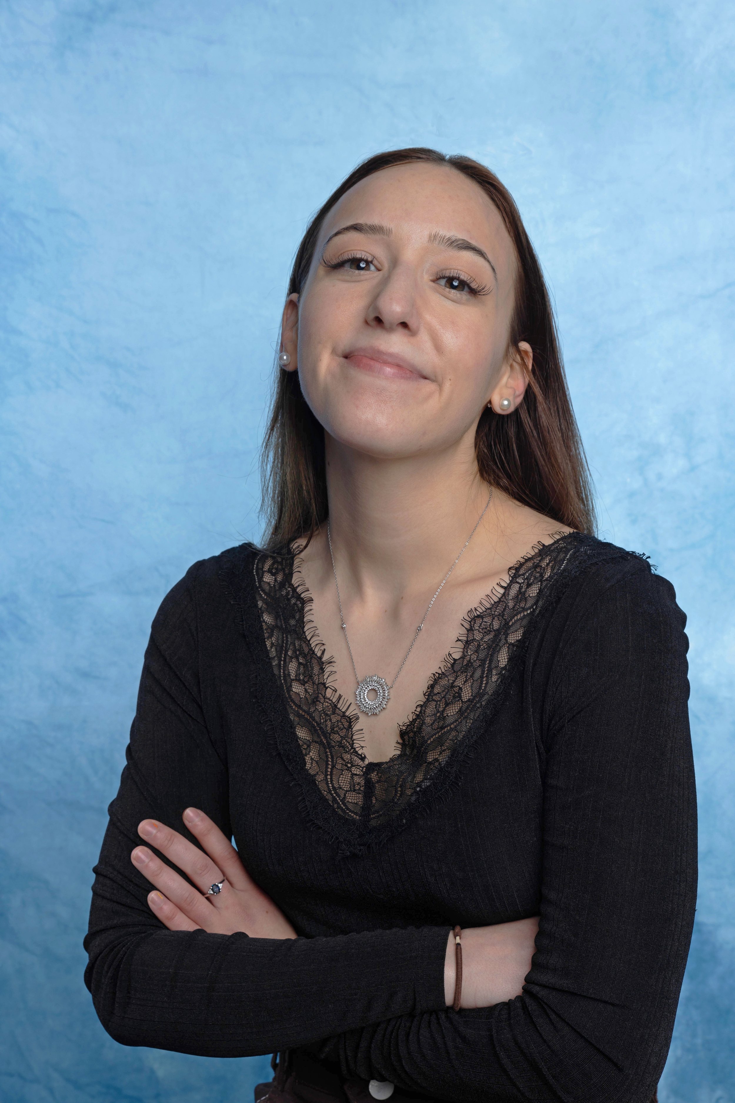
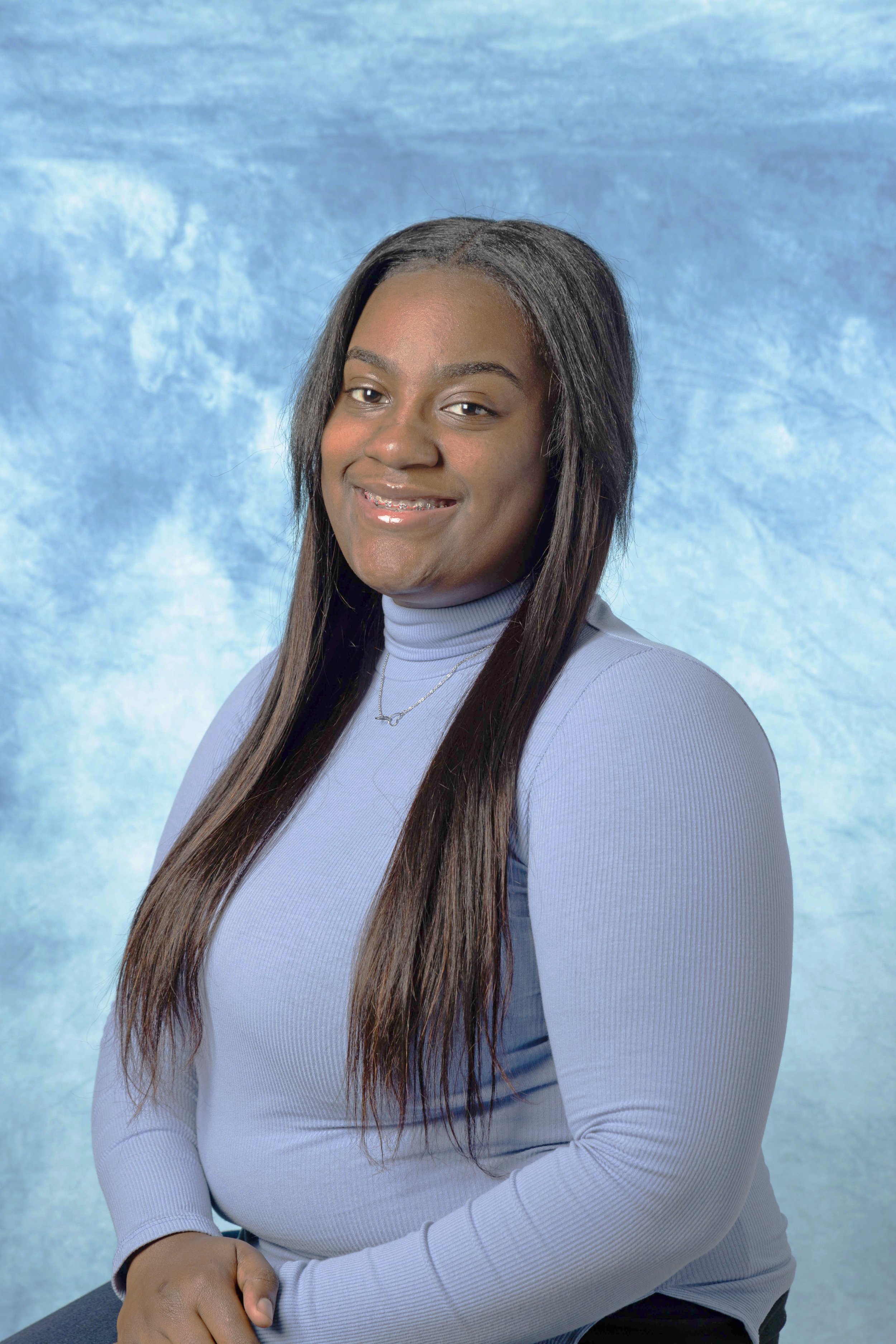
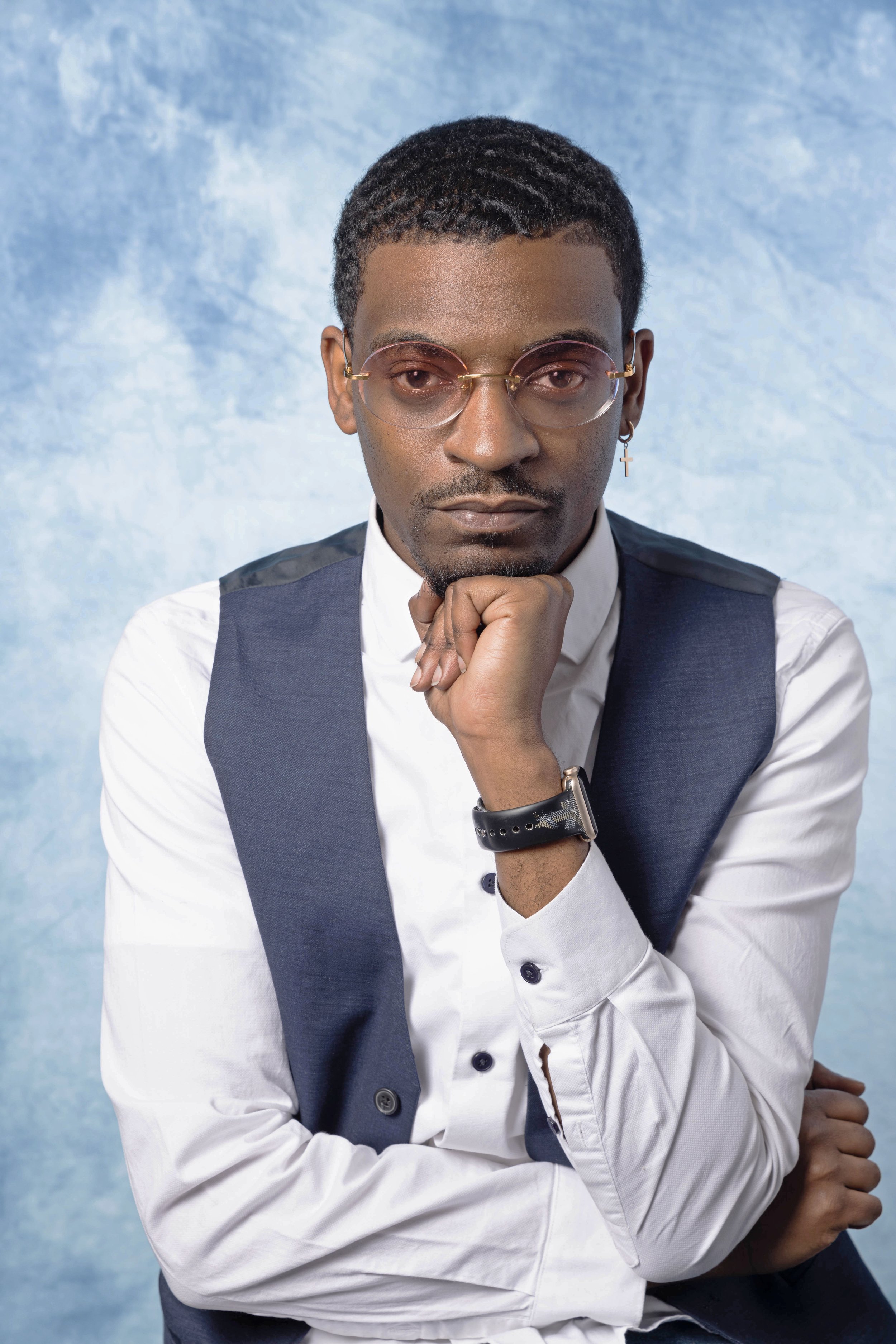
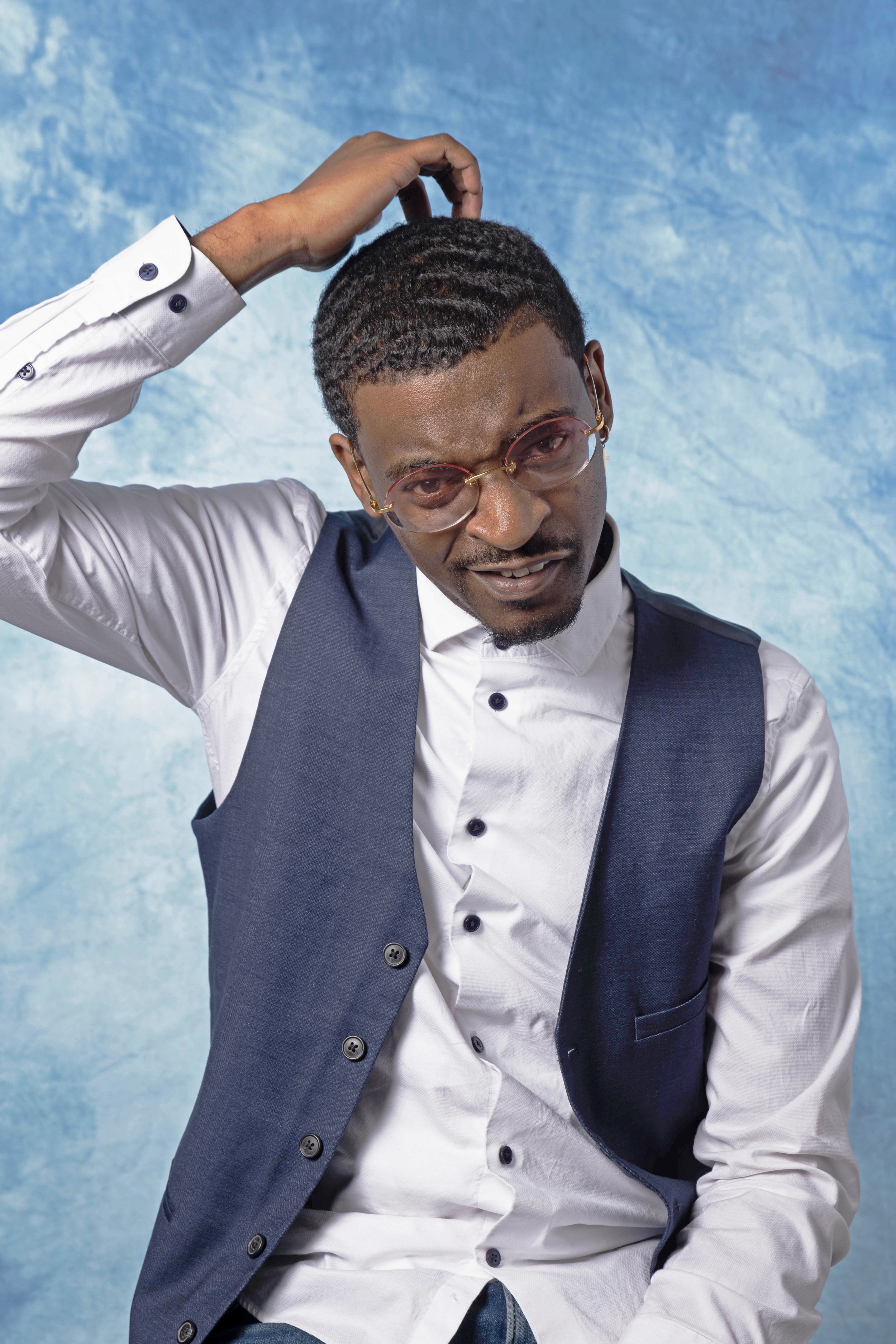
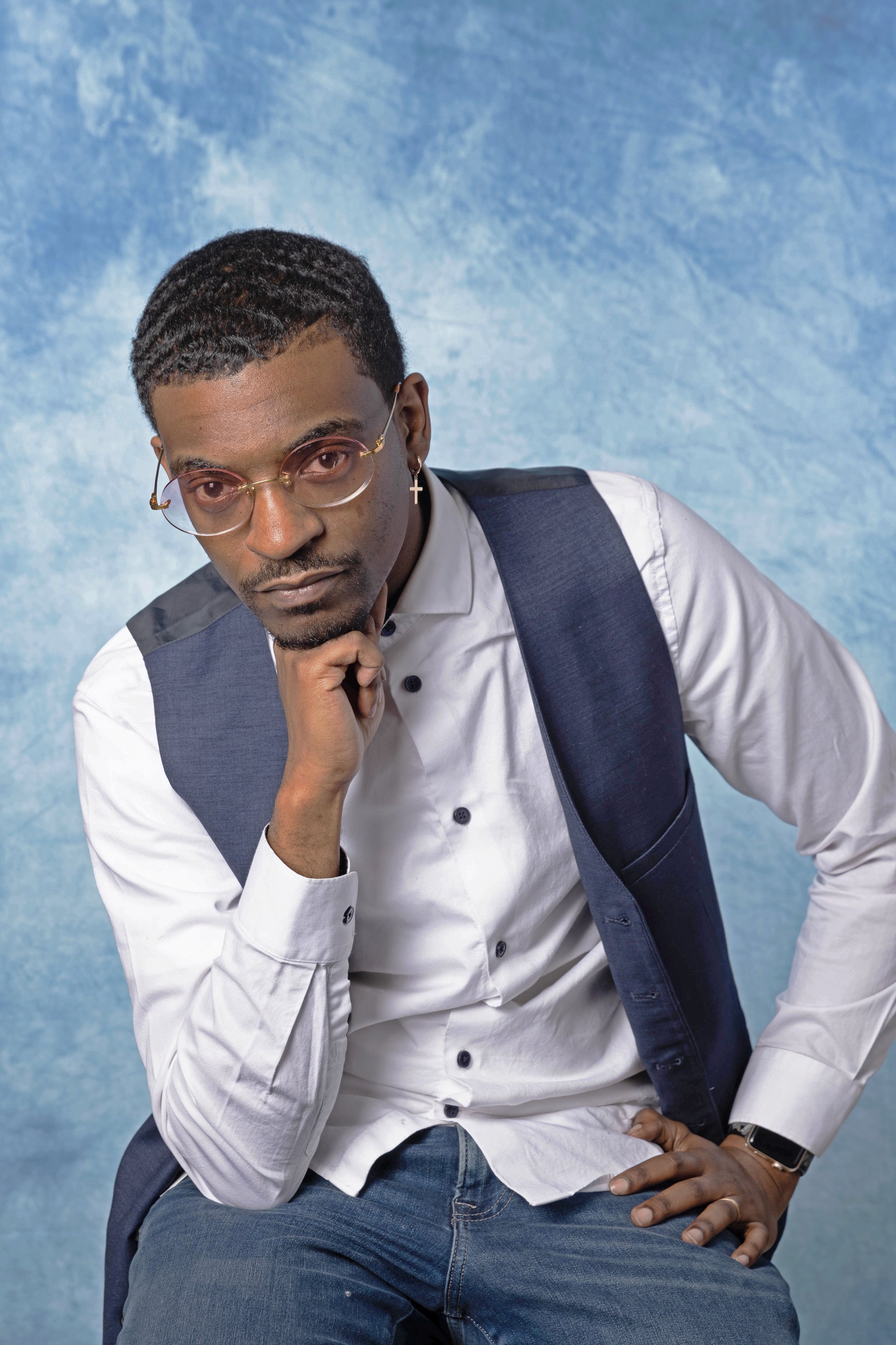
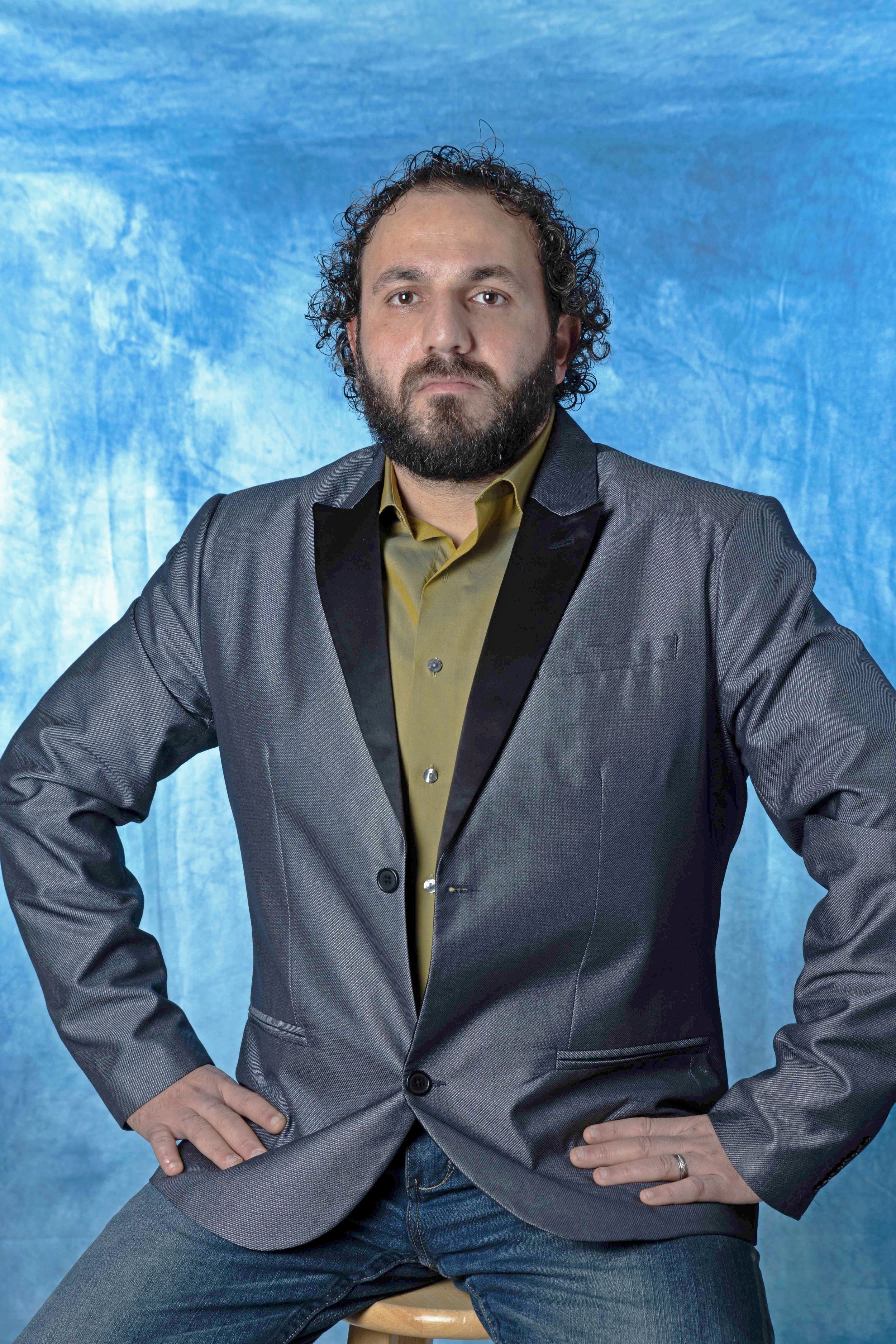
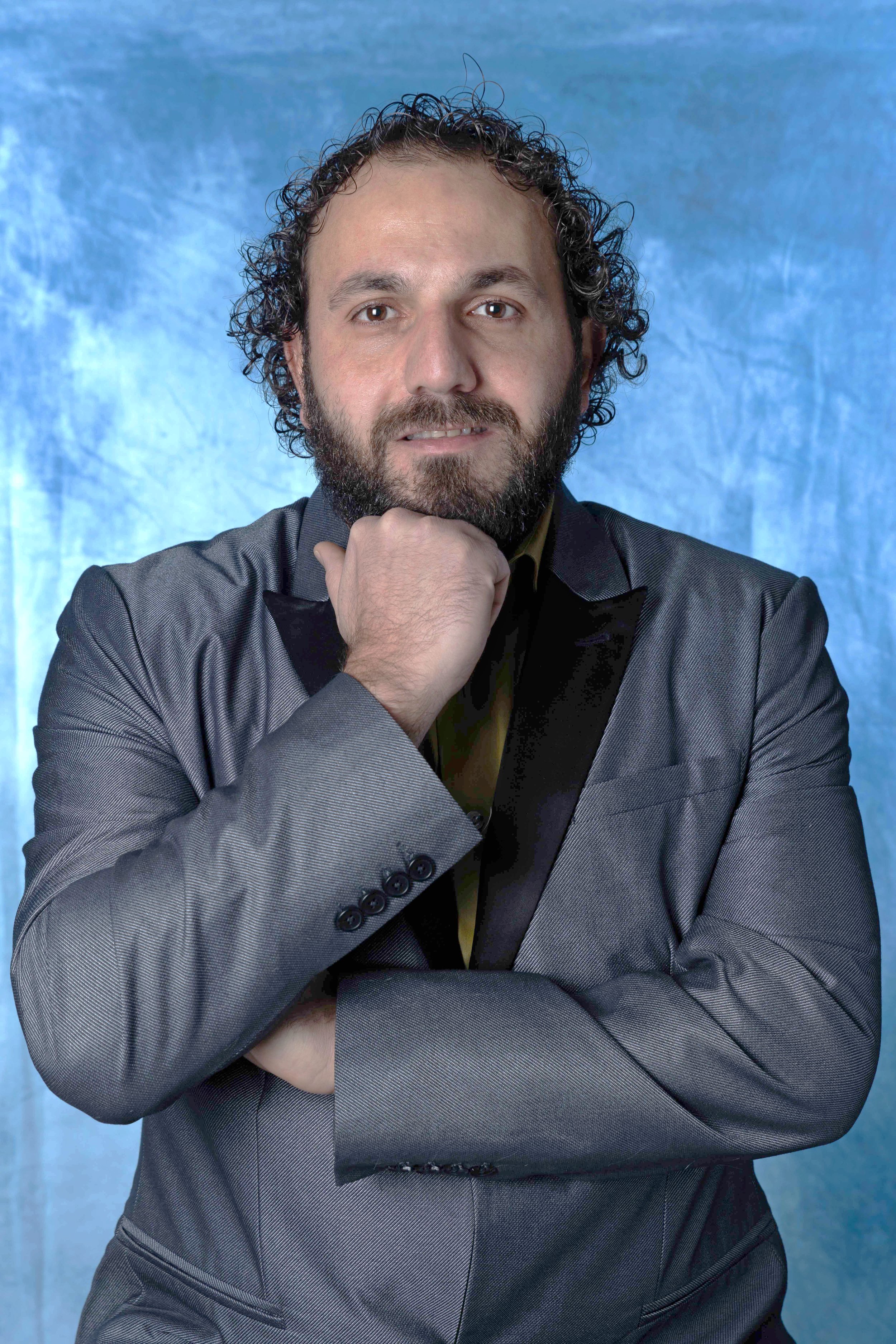
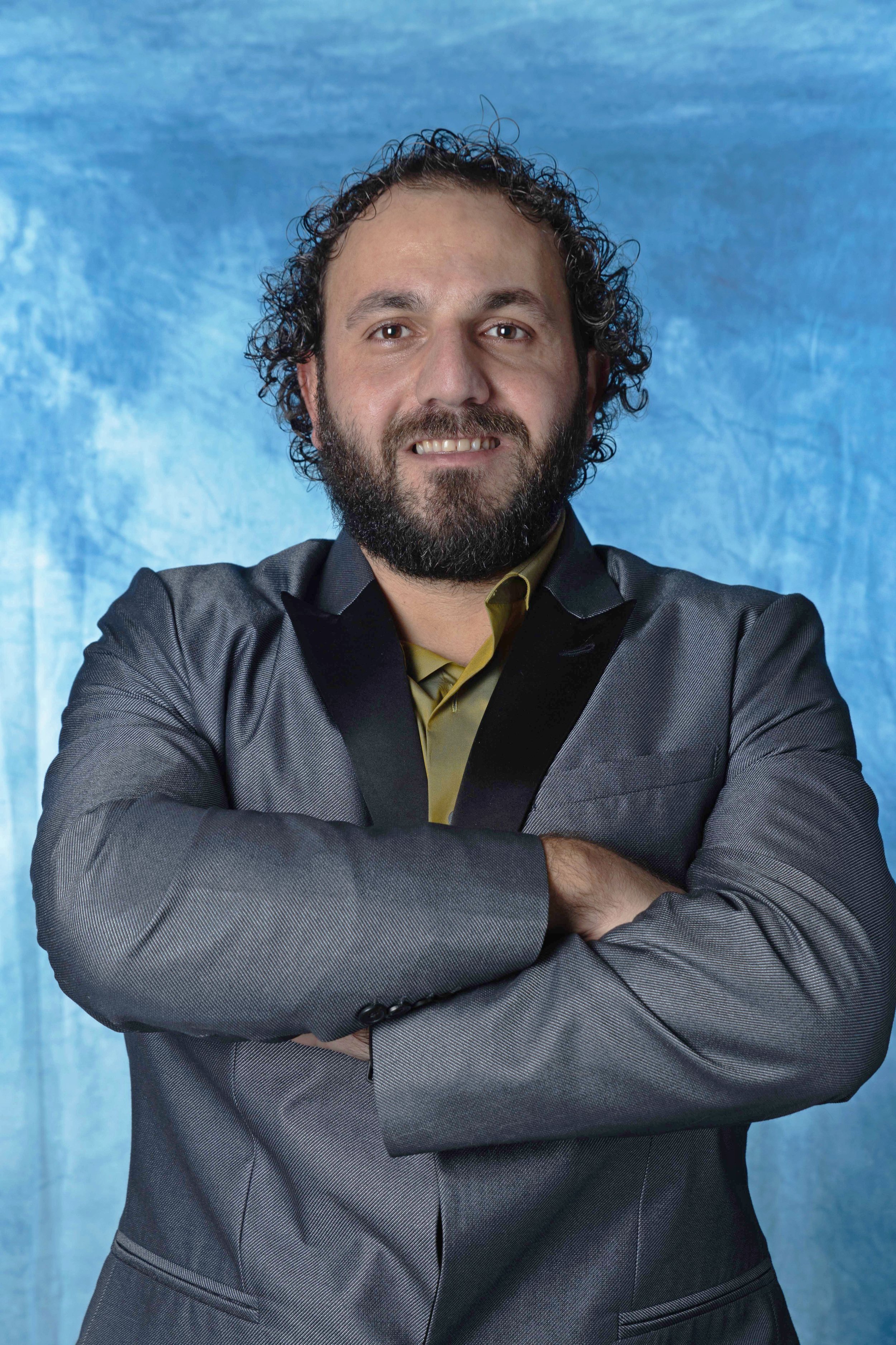
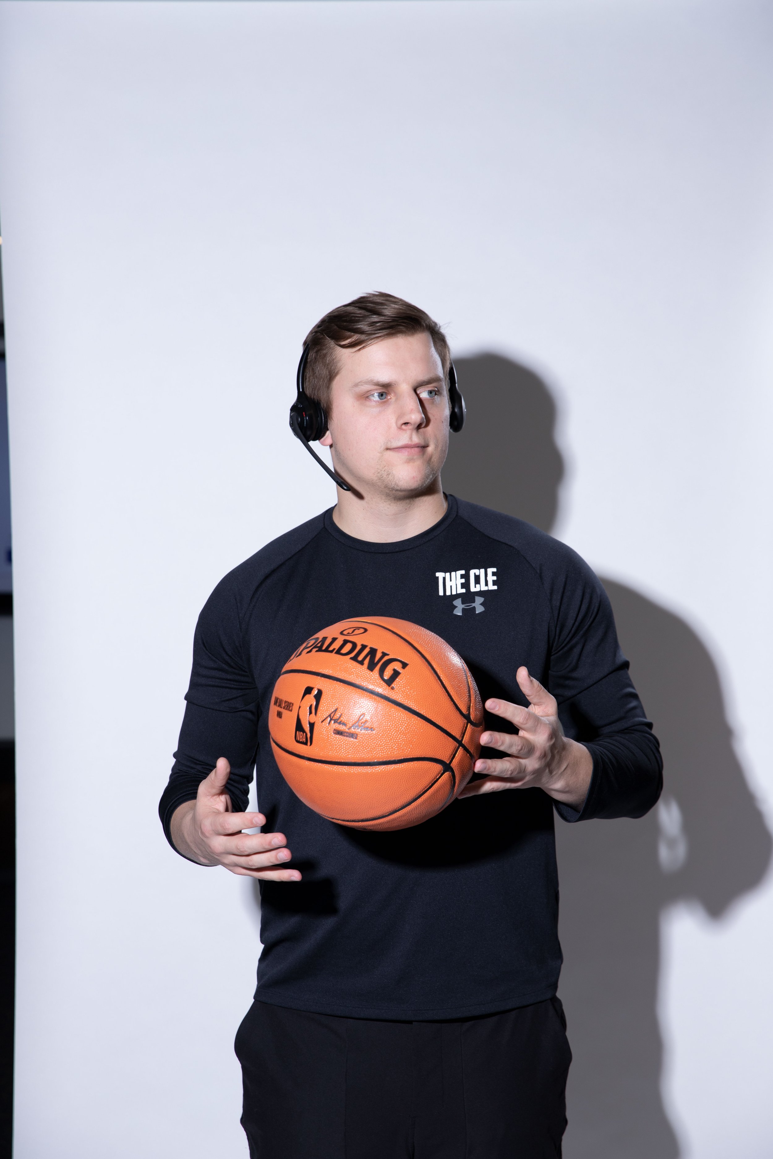
Photoshoot Direction
As stated above, the aim with photography was a look reminiscent of school yearbook photos. Each highlighted team member won a “Superlative Award” - they talked about their experiences and overall stories. By working with the photo team to realize this vision, these photos seamlessly fit into the publication and overall tone of the designs.
These photos were taken by Carie Pitzer from Rocket Mortgage Marketing with direction provided by myself. Carie and I also worked directly with the subjects on posing and framing, as well as adjusting the scenes to make sure that the overall look of the photos fit the tone of the publication.
Issue 31
〰️
Issue 31 〰️

Design Direction
The 31st Edition of the Elite News focused around the annual “March Madness” Promotion at Rocket Mortgage - then Quicken Loans. This edition functioned partially as a marketing tool for the promotion as it would release right before the promotion would launch.
The design focus was based mostly around the branding for the promotion which was designed by myself. This design went for more of a vintage basketball look and feel with a focus being on minimalism and athlete (team member) spotlight. A lot of the main design systems and colors from the branding were also incorporated, such as repeated lines, basketball icons, and brackets. The design team worked from the mood board and logo styles to realize this vision.
Content page designed by Marting Querio
Mood boarding for issue
Interview Section Designed by Martin Querio and Photographed by Carrie Pitzer
Introductory Section designed by Charmaine Mei with Direction and Logo provided by Martin Querio
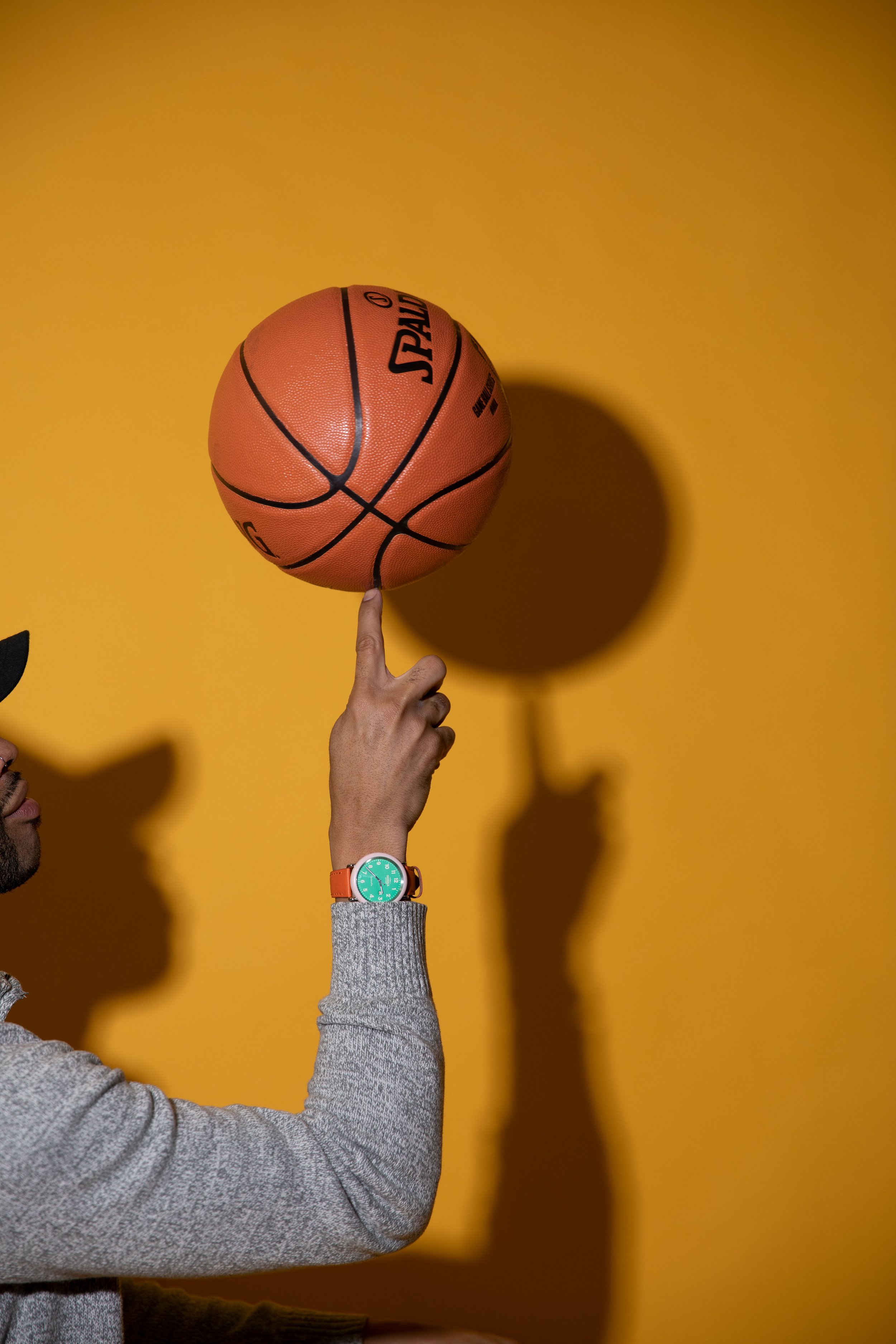
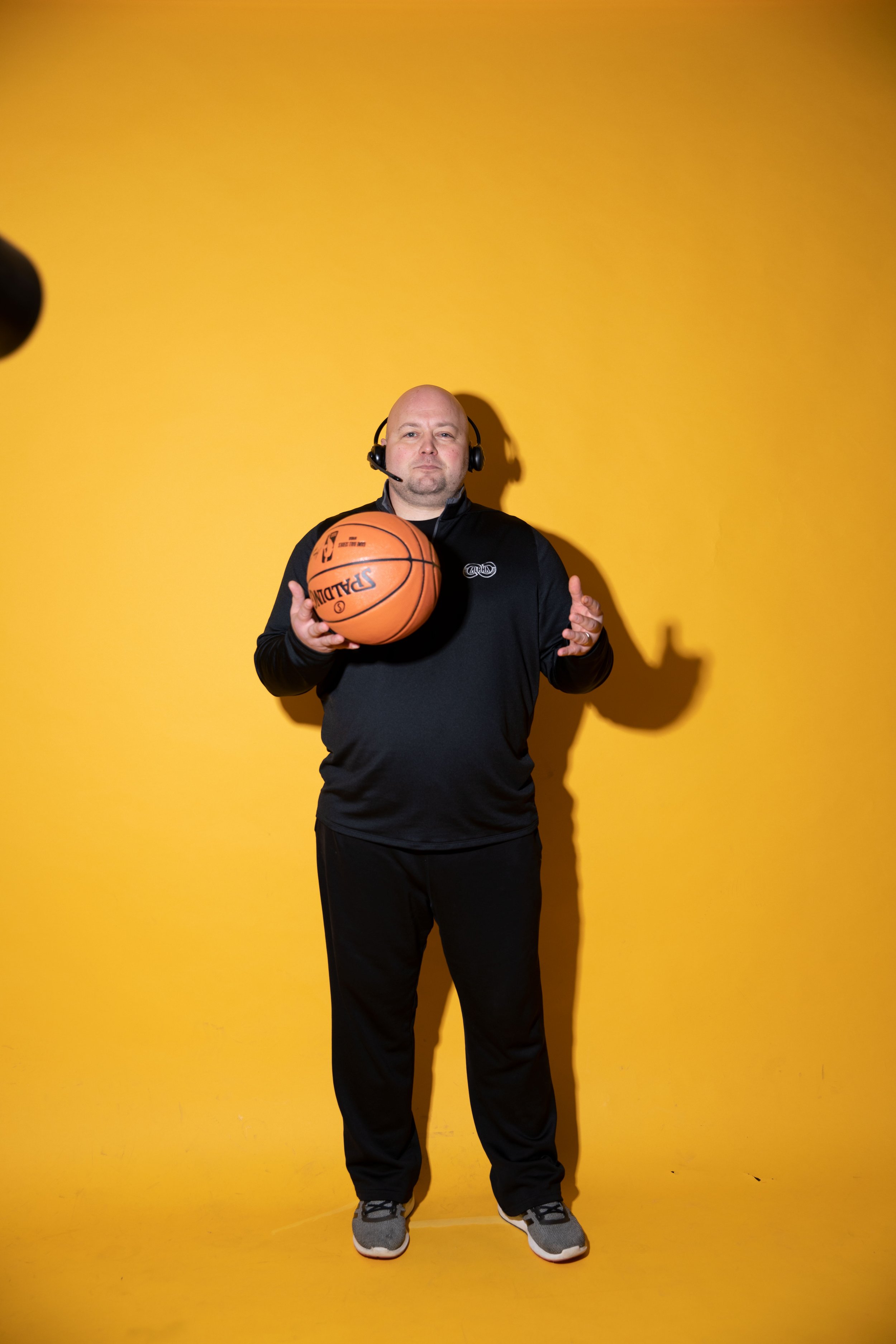
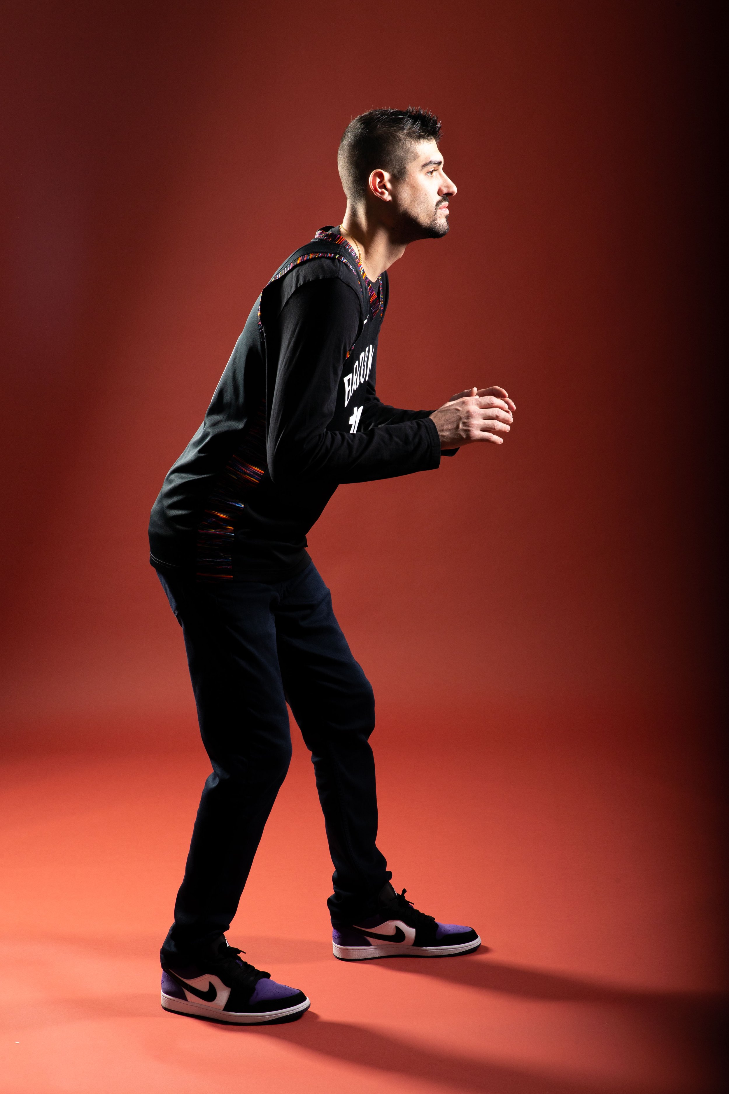
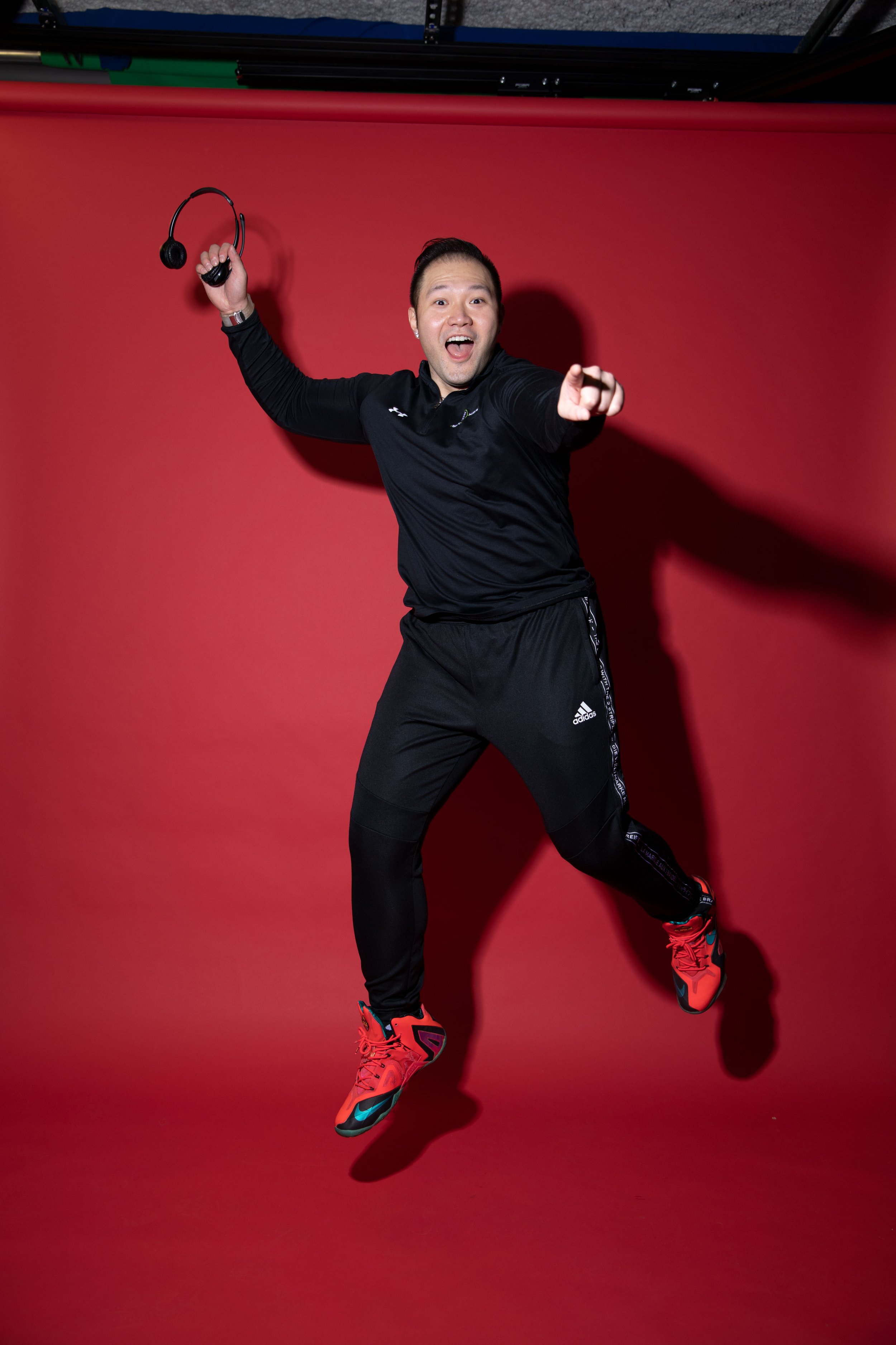
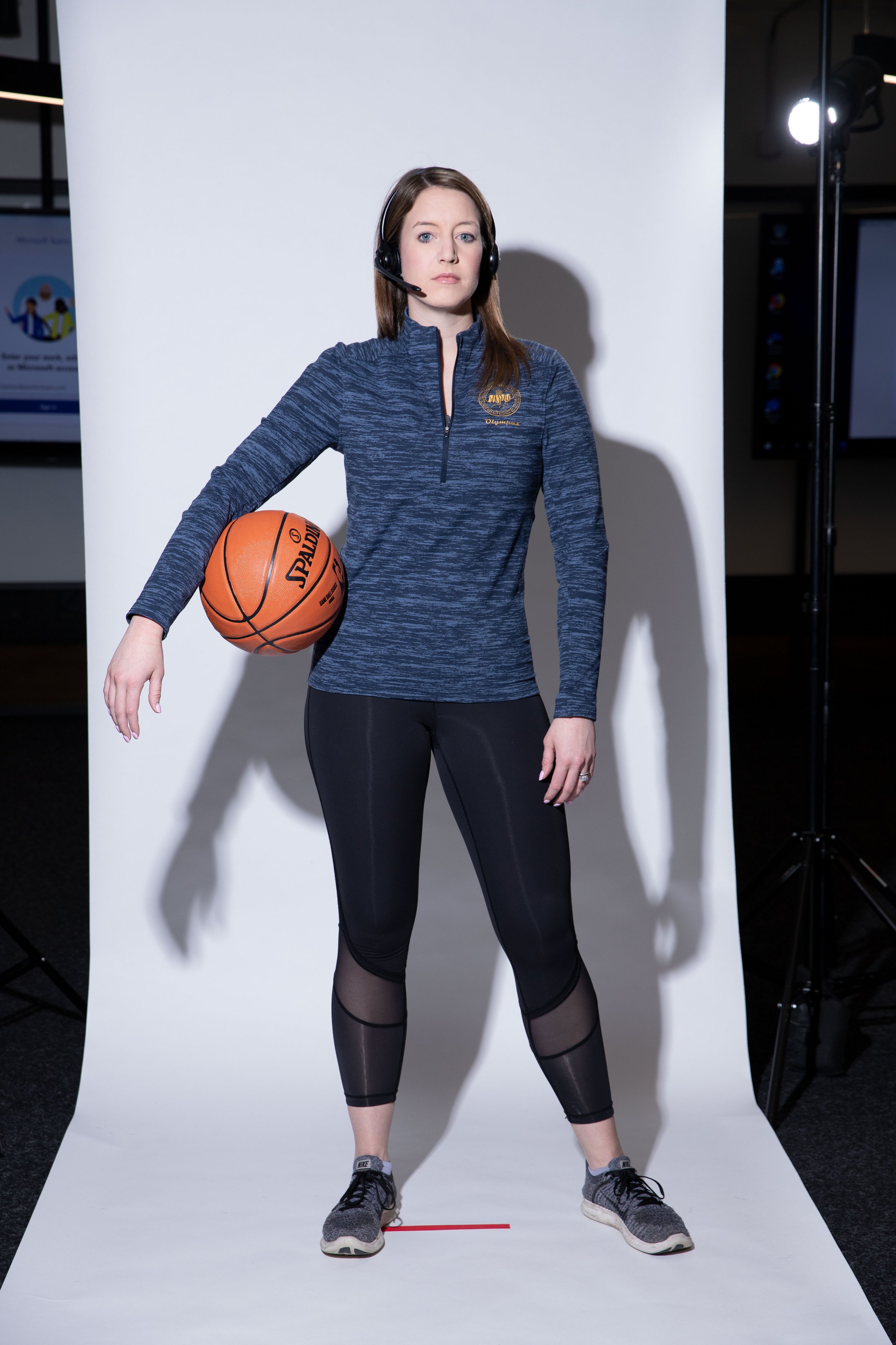
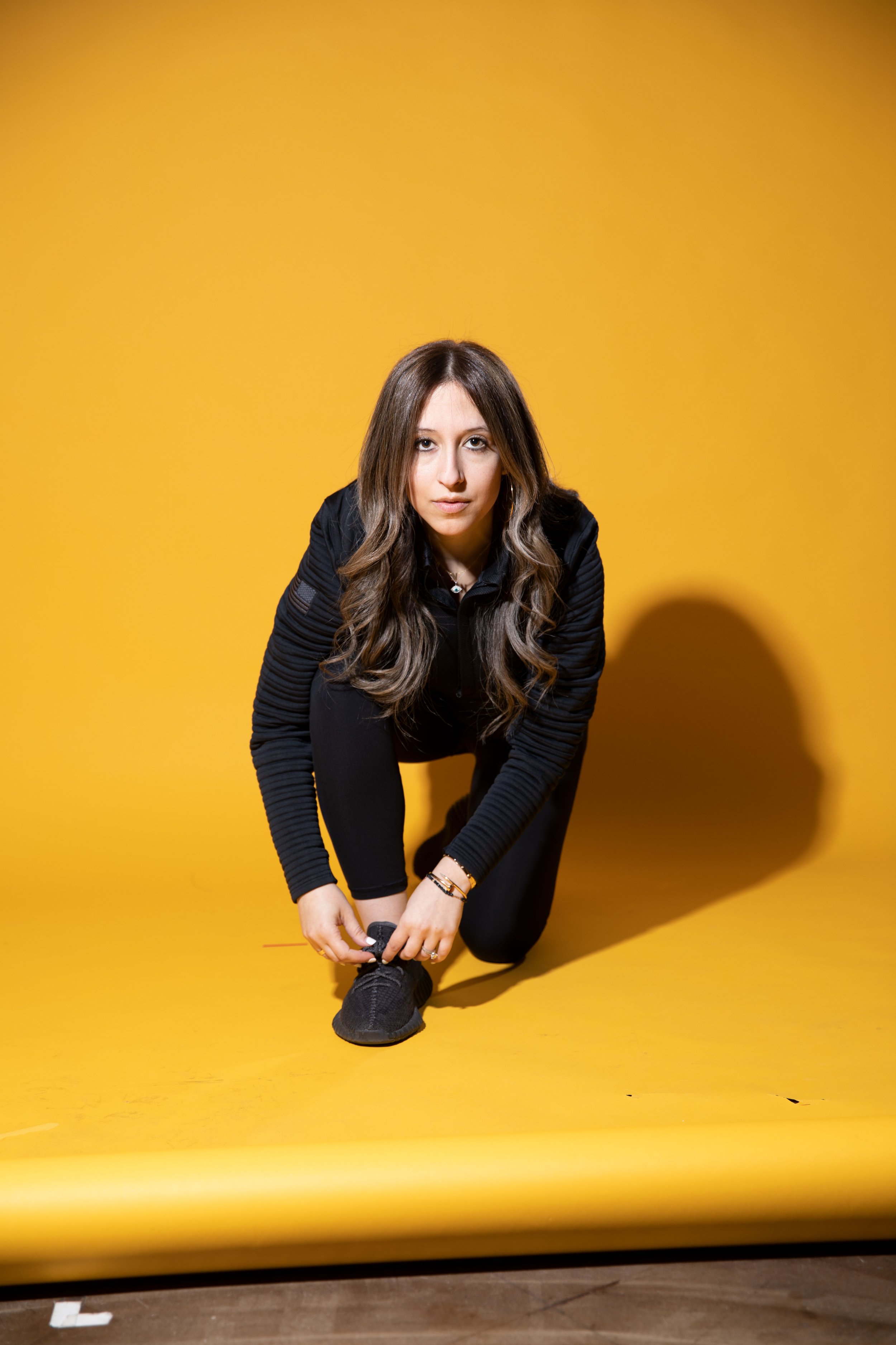
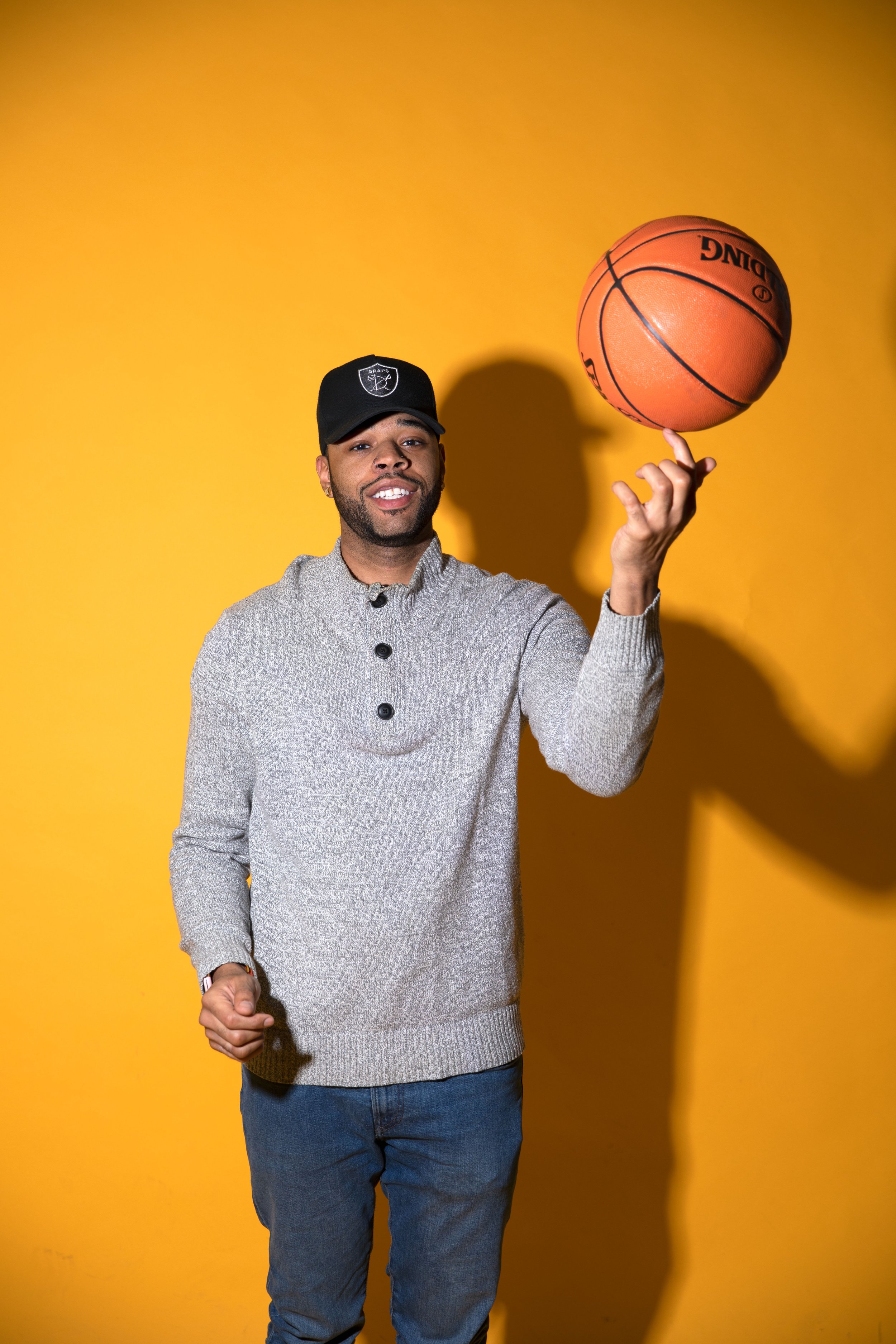
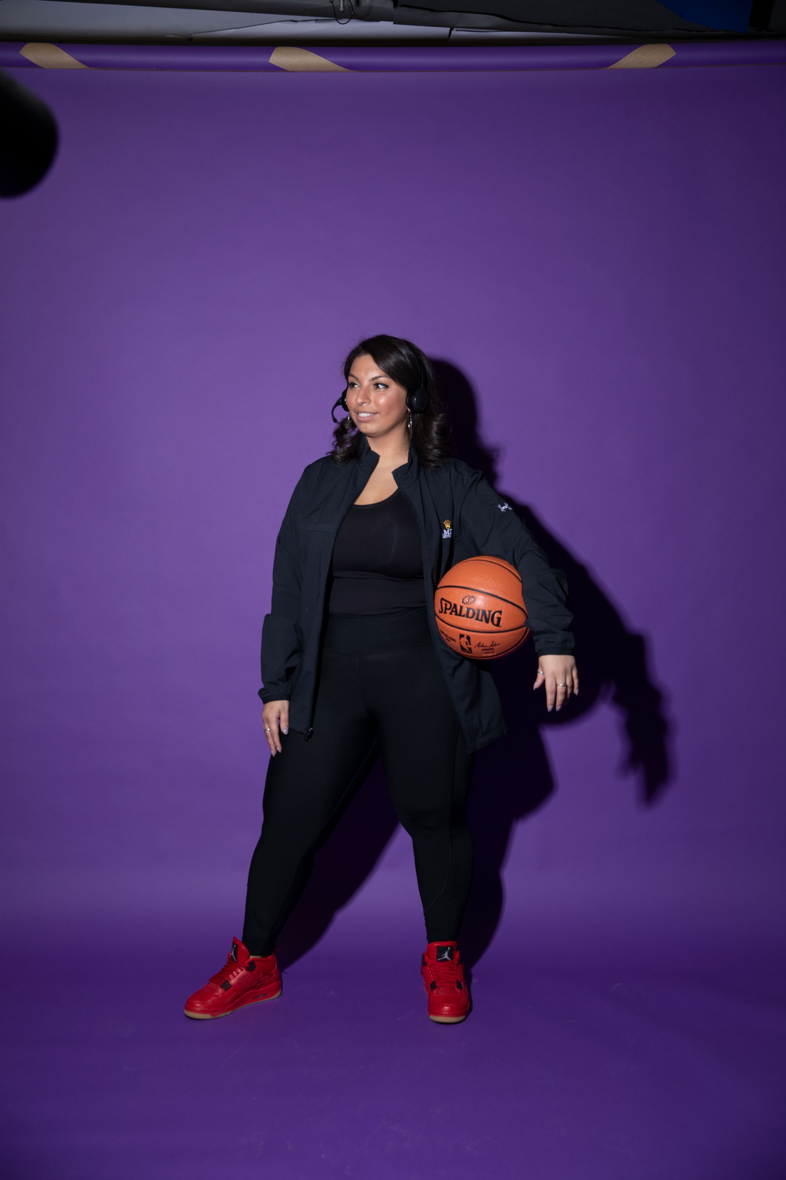
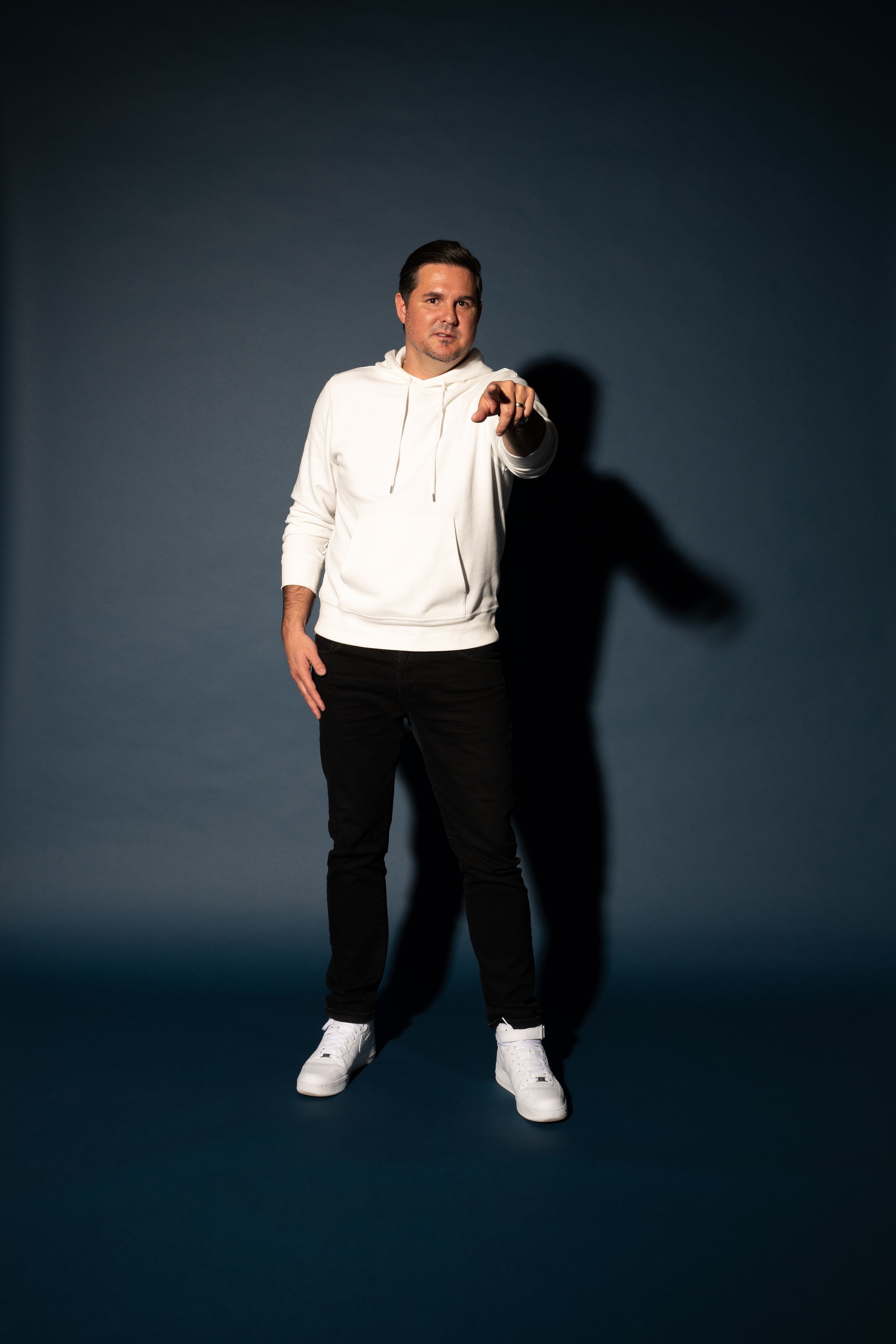
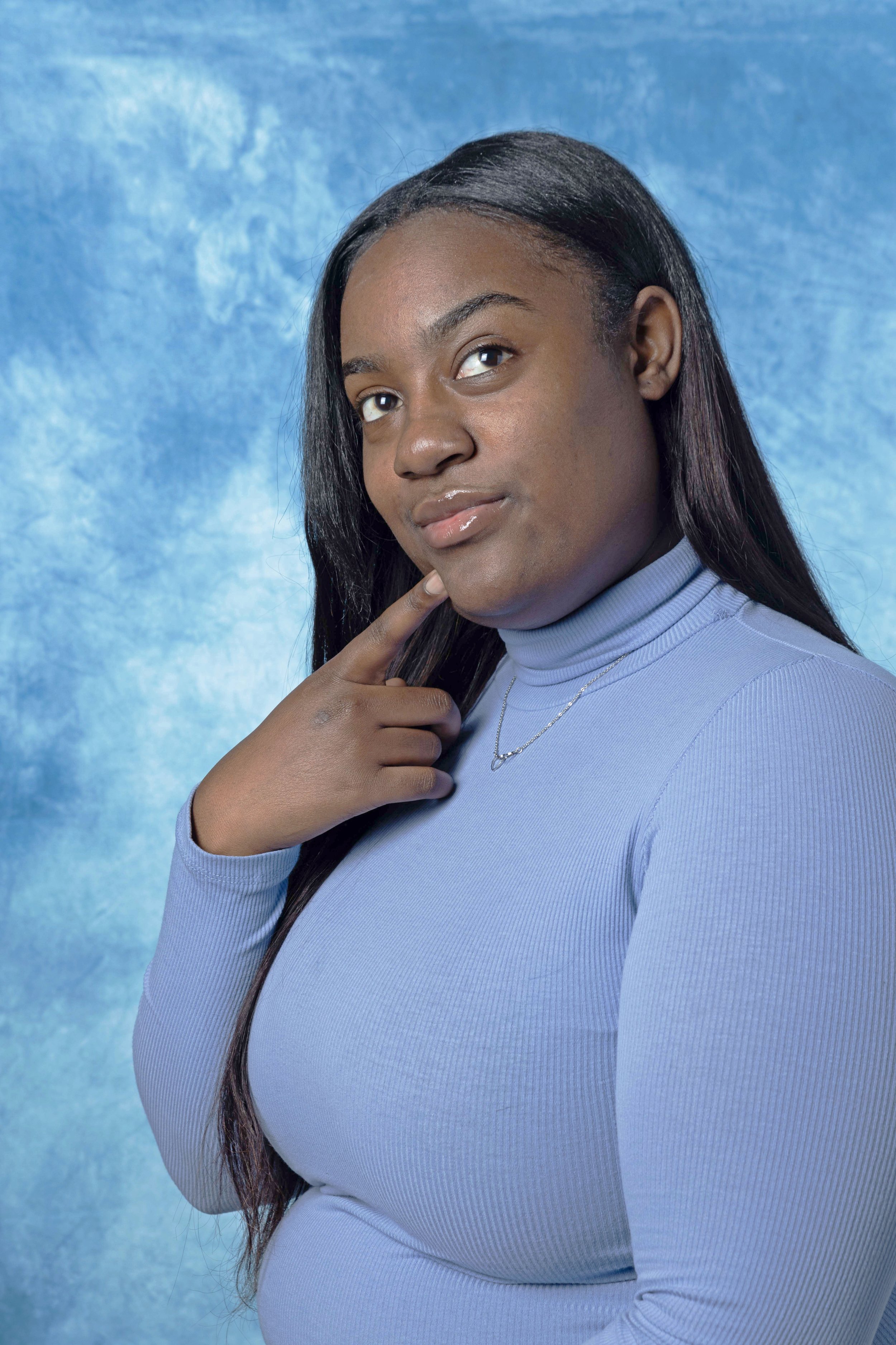
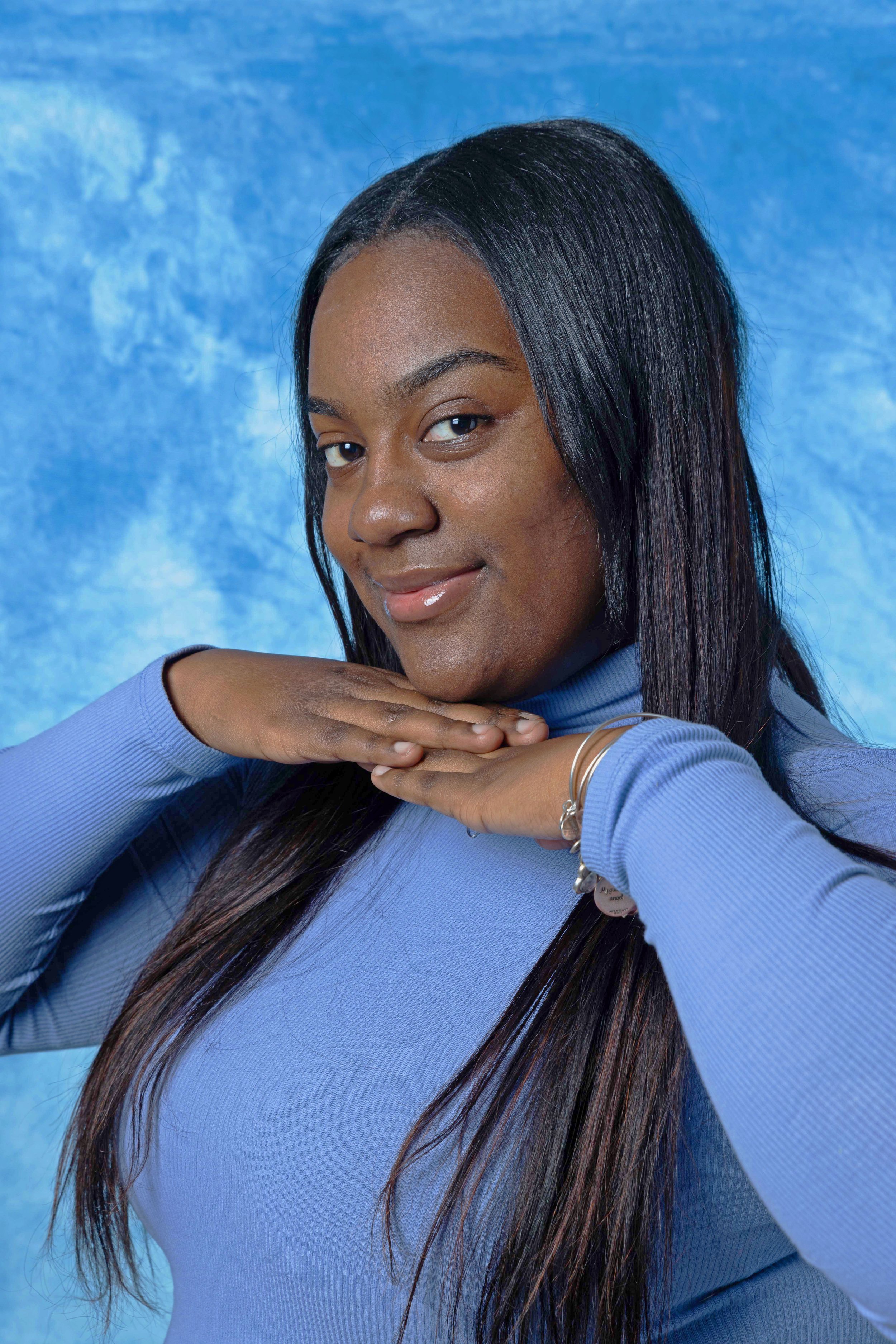
Photoshoot Direction
The main focus for the photography was an “athlete” spotlight. For this, we use the main brand palette, implementing colored backdrops and a hard contrast to have a minimalist showcase of our subjects. We wanted a clear shadow to be visible and after photography was completed, we extended these backdrops in interview spreads and implemented design systems around the interview subjects for a more integrated experience.
Photos were taken by Carie Pitzer from Rocket Mortgage Marketing with direction for posing and lighting provided by myself. Our aim was a somewhat serious tone, but if we felt some of the more fun poses were applicable, we would use those shots. We also implemented the same style for the cover and were able to utilize a subject balancing a ball on his finger. Overall, this was a very tonally and brand consistent edition that worked very well as a marketing piece.